• K3 House by Bruce Stafford Architects

    This dramatic renovation centres around a spacious internal courtyard defined by natural rock face and lush vegetation. Large sliding glass doors in the main living area enable a seamless flow between inside and outside. The living areas also have the added benefit of glazing on the north façade which opens up the house to the view. The master suite pavilion, perched on the highest portion of the rock face, has been designed as a sanctuary for the parents, whilst maintaining a bird’s eye view over the living areas.

  • The Fourth Wall by François Bauchet, Eric Jourdan and N°111

    Initiated by N°111 with François Bauchet and Eric Jourdan, the Quatrième Mur was one of the off exhibitions which spearheaded the event during the St Etienne Design Biennial 2010. In a former cinema and with this mysterious title, three ex- Saint Etienne students invited two of their ex-lecturers for a collective exhibition in the shape of tribute-thanks-transmission with a result which lecturers and pupils alike can be proud of. The installation comprised everyday objects which, through their design and varying scales, gave rhythm and composition to the scenic space. The objective was to encourage the spectator to observe the objects from our domestic environment from a different angle and to reconsider the relationship between objects. “The fourth wall evokes an intellectual wall separating the actor on the stage and the spectator in the room. The installation of the objects on a stage puts distance between them and the spectator. The goal of the distance is to lead the spectator to consider what is taking place on the stage with an investigative and critical eye. To distance, is to transform the thing that it is to be understood, to which attention is to be drawn, from something banal, known and immediately fixed, into something distinctive, unusual and unexpected. ” N°111 .

  • The Enclave Interior by Jamie Herzlinger

    The clients are world travelers and after a brief period of time living in Milan, they understandably fell in love with the work of Carlos Scarpa! Interpreting his work in combination with the client’s lifestyle made this project very exciting and unique. The house had to be completely gutted, and it was only then that the soaring ceiling heights were discovered. Within the box of space that previously evaporated the entrance, dining room, hallways, and living room, we were able to make each of those public areas very dramatic by the controlled use of the bead blasted steel and poured terrazzo floors that had zinc screeds inlayed for a distinct separation. In the entry, the angled cabinet is a beautiful dining room buffet, fabricated in Makassar ebony and supported within two bead blasted steel columns. It is cantilevered in order to create a visual separation from the entrance, but at the same time contributing to the architectural details. The original master bathroom was combined with a walk in guest closet to create a larger space, as the programming required that the couple preferred to use the bath area together, thereby necessitating a larger space. Visual fluidity and an informal atmosphere were the driving and guiding principles in the complete renovation of this project. .

  • Streetwalk by Charlie Davidson

    A commission won through an open call for artists from Sunniside Partnership, the acting body in charge of revitalising the Sunniside area of Sunderland. Charlie Davidsons original proposal was for a series of benches that had the appearance of walking. This idea was a direct response to the brief which asked designers to draw pedestrians into the east side of town and the newly furbished Sunniside gardens from Sunderland city centre. The original designs were too big for the finalized street layout so the designs were developed into a stool module. The final design is cast in a polymer based cement with coloured quartz and marble aggregate.

Contemporist Architecture : West Seattle Residence Design by Lawrence Architecture

Lawrence Architecture have designed a home in the West Seattle district of Seattle, Washington.

A modern house on view property with 3,800 SF of living space and a 925 SF detached garage. Primary materials include concrete, steel, and glass. A concrete wall up to twenty-four feet high organizes the site and the house: the garage, entry and service spaces are on the street side of the wall, while providing privacy for the main living space which is a curtain wall-enclosed pavilion. The wall is also the organizing element for the circulation including the stairs with cantilevered steel treads. Supported on steel frames and triangular steel trusses, the roof swoops over the concrete wall capping the pavilion. Eight by sixteen foot sections of the curtain wall pivot for ventilation. The stair has demountable guardrails which are normally in place but were removed for the photographs.

The master bedroom is in a loft space above the kitchen, while a family room, media room, children’s bedrooms and bathrooms occupy the daylight basement level. There is additional living space above the garage accessible via stair or future elevator.


Design Team: Thomas Lawrence, Blake Takamura, Billy Stauffer
Visit the Lawrence Architecture website – here.
Photography by Benjamin Benschneider


Contemporist Architecture : Hermes Boutique at the Hotel Lutetia by RDAI

RDAI have designed the Hermes Boutique at the Hotel Lutetia in Paris, France.


Hermès has entrusted the RDAI agency, which is reponsible for designing all the Hermès stores worldwide, with the design of a new space, singular and unexpected in Paris. Hermès is setting up shop in a swimming pool…An immense volume, empty. An impression more of space than of surface area. And now, at the end of a project that added but did not take away, the Lutétia swimming pool, in the heart of the Saint-Germaindes- Prés quarter of Paris, has metamorphosed into the first Hermès boutique on the Left Bank. The architectural project led by Denis Montel and the teams at RDAI mixes contrasts and complementarities. It was imagined more in terms of volume than surface area, in m3 more than in m2. In the end, it is an intervention both radical and astonishingly gentle.

Listed as a Historic Monument since 2005, the swimming pool built in 1935 has a strong architectonic character and a compelling identity, that of Art Deco – it is in the spirit of its age. After its closure, the swimming pool underwent varied and diverse uses and was transformed. The challenge was to translate some of the values intrinsic to Hermès into space: heritage and modernity, savoir-faire and creation. The project has a double aim. First of all to respect, conserve and reinterpret the architecture of the swimming pool. The only important modification was the covering of the pool by means of concrete composite floor slab supported by a light structure. Underneath, the pool has been integrally preserved. The facade, giving onto the rue de Sèvres, has kept its original appearance. Then, to tell another story, one that is resolutely contemporary. This takes form through the appearance of three monumental ash huts which both disrupt the existing volumes and converse with them. The invasion of what was once the pool by these huts, flexible, light and nomadic, suggests the creation of houses within the house. A change of scale, an invitation to wander, to drift, which produces a powerful magic… Everywhere the movements seem natural, they are fluid, rippling. The shimmering of the water that was once here is evoked in a subtle way in the tones of the mosaics, in the effects of the lights… What existed and what has been added converse in a strange harmony. They are whole, they are complementary.

THE ENTRANCE
At the foot of an elegant apartment building from the mid 1930s, the facade of the Hermès store is discreet. An entrance portico in the centre between two windows, nothing to hint at the surprise awaiting once through the doors…The entrance is like a lightwell overturned, horizontal, which attracts one irrevocably towards the light at the back, towards what was the Lutétia swimming pool. The entrance to the store must function like a delicious trap into which the visitor lets himself slide, from crossing the threshold of the doors on the street until he reaches the swimming pool and its strange inhabitants, the huts. To guide him, the perspectives are accentuated and modified by an imperceptible contraction, rather like the sides of the Médicis fountain in the Luxembourg garden. The lightly inclined ceiling, the walls curved and leaning inwards, covered with oak laths that leave recesses open as if floating in matter. An introduction full of mysteries inciting one to plunge into this new Hermès house…

THE HUTS
Four pavilions with an organic design, in which some will recognise familiar forms from the plant or animal world, or from childhood…Others will liken these huts, which occupy the volume of the swimming pool, to the nests of tisserin birds. These pavilions of different form and dimensions are constructed in ash wood. They are self-supporting structures that rest on a system of woven wooden laths (profile 6x4cm) with a double radius of curves. The documentation and three-dimensional drawing of the complex geometry of each hut was made possible by the computer script written for each one of them. Rising to more than 9 m in height, they lean progressively, as if attracted by the skylights. The huts house the Hermès collections. They seem to have simply alighted on the ground, lending the project its nomadic dimension. The fourth hut, which appears to be lying down, lines the staircase that naturally leads the visitor towards the pool and forms the link between the entrance and the open space of the swimming pool.

THE LIGHTING
In such a volume, the lighting is crucial. The entire space is bathed in natural light that penetrates through the three large skylights above the atrium, softened only by a metal screen. At night the skylights are lit to avoid a “black hole” effect. In order to avoid putting the spaces overlooking the pool that previously housed the changing rooms, in the shade, the effects had to be measured out, the contrasts that would otherwise have been too harsh attenuated. All the vertical panels are therefore also lightly illuminated. The undulating walls in white plaster, running around the ground floor, are lit from above by LED tape with the light source hidden from view. Lit from the interior, the huts appear as giant lanterns. A lighting device embedded in the floor, illuminates their vaults of latticed wood. Each hut has a large chandelier composed of a double ring of suspended wood. The shelving is lit by integrated and invisible LED tape.

THE MOSAICS
The Lutétia swimming pool is a mineral world. The floors, the columns, the staircases are covered in mosaics, broken tiles or granito. The existing ornamental elements on the floor and the walls have been preserved and restored. Through the play of this transformation, this world has discovered several new forms of expression… In the entrance to the store, a mosaic carpet with a Greek motif (a nod to the flooring of the Hermès store at 24 Faubourg Saint-Honoré) welcomes visitors. Following this desire for coherence, the steps and risers of the large newly created staircase are in granito. Adding to this refinement, the floors of rooms less visible to visitors (such as the fitting rooms, the bathroom) have been worked in broken tiles. It is a means of writing these new spaces into the history of the swimming pool. The surface of the pool is adorned with a mosaic covering, whose texture and composition of ceramic and glass mosaic tiles evoke the movement of waves. Shiny and matt tesserae in different dimensions and in multiple colours and white gold seem to vibrate as one moves around. A random approach to the composition in graduated tones creates effects of depth and sparkle accentuated by the play of light.


Visit the RDAI website – here.
Photography © Michel Denancé


Contemporist Architecture : The Larix House Designs by Corvin Cristian

Architect Corvin Cristian has completed the Larix House in Snagov, Romania.


The old wood boat sheds on the neighboring Snagov Lake inspired the shape and materials of the house. The lot is narrow thus generating the plan and position. For intimacy reasons, the street elevation is totally opaque while the openings abound towards the courtyard. Sun protection is provided by exterior electric aluminum blinds that slide underneath the wood facade when not in use. In the austere geometry of the house we introduced some “romantic” elements as the curved balcony handrail or the 1900 colored concrete tiles. The Thonet chairs, the ottoman inspired sofa from Autobahn, the reclaimed wood coffee table or the Matthew Hilton “Oscar” armchairs are a counterpoint to the white minimal space. The walls are to be filled with a collection of paintings.


r


Visit Corvin Cristian’s website – here.
Photography by Cosmin Dragomir

Contemporist Architecture : Noble Remix Decorating Ideas by T.R.O.P. Studio

Pok Kobkongsanti, the lead designer with T.R.O.P. Studio, has sent us images of their latest landscape design project called “Noble Remix” in Bangkok, Thailand.


What is the role of Landscape Architects in the World with Global Warming problem? How could we help reducing the heat wave? Could we encourage people to plant more trees? Those are some questions we have in mind all the time. And finally we have a chance to start adding some more “Greenery” back to the Urban Landscape.

Located at one of the best locations in Bangkok, Sukhumvit Road, Noble Remix is a Residential Project, plus Retails on its first floor. The project targets at young professionals, who love modern way of living (with a little sense of humor). We got a commission to design its plaza on the ground floor. The area is sandwiched between the building and Sukhumvit road.

Our client did not give us specific programs or tell us what they wanted. Basically, they just needed some Green Area to apply for the EIA Permit, in order to use the building. So we have to find out what could and should be done here.

First, we studied the area, Sukhumvit Road. The Road is not only the prime area for any project, it is also one of the worst traffic-jammed areas in Bangkok. The area would have a series of very bad traffic jams during a day, from early morning (6am-10am) to the evening (5-sometimes, midnight).

The site, even though it is located on the great location, just got no great view on any side of the project. So, instead of looking out, we think that the plaza will be something that people looking at. It will be a new eye candy of passing-by people (pedestrians, drivers, and Train passengers from above).

Naturally the plaza can be viewed from 2 Sides, from the building and from the road. The word “2-Sides” became our first rolling point.

We thought about Thailand’s old philosophy “a coin has 2 Faces”, which can be applied to any human life. In one’s life, a person could have 2 faces as well. On the front face, there are Look, Work, Responsibility, Taste, etc. On the backside, without anyone looking, one may has Lust, Personality, Play, etc.

We liked that thought, so we applied the 2-Faces character to the design of the plaza. On the front side (we call it a “Front Face Garden”), looking from the road, we want to show our Environmental Concern. We thought about Giving back some Greenery, O2, and Shades to the public, for the people who are trapped in the traffic.

Instead of creating some garden for our residents and shoppers, we proposed a huge Green Landform, slightly sloped up from 40cm to 1.50m at the highest area. Instead of typical Shrubs-and-trees garden, we want to make a bolder statement by using very tall trees instead. Seeing Big trees on Sukhumvit Road is not a common sight. Underneath those towering trees, we did not want to use grass, which needs a lot of water. Instead we planted some ground cover with purple flowers to compliment the color of the building.

On the “Back Face”, we wanted it to “play” a bit more to show The Project’s true Nature.

Here, a series of circular space are crafted into the Green Landform, creating seating space with different sizes. Smaller one for 1-4 people and the bigger one for a dozen. Those circular areas are formed by Retaining Wall, with different textured Terrazzo to compliment the name of the project “Remix”.

What makes this garden more interesting is that people from the outside can’t really see interior circular space. Only once they move inside the project, then they will experience the other Face of the garden. At the same time, people from the inside won’t feel threatened by the Traffic jam outside. Because we provide such a high land form, it helps screening some of the unpleasant views and noises.

At the end we got what we hoped for, one garden with 2 Faces for 2 different purposes. One for the Public and the other for the Private.


Visit the T.R.O.P. Studio website – here.


Contemporist Misc : Sottovoce Winterthur by Huub Ubbens

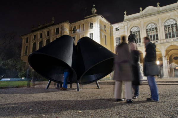
Dutch designer Huub Ubbens has created the Sottovoce installation at the Indro Montanelli Public Gardens in Milan, Italy.


Milan (Italy), December 1st, 2010_ Huub Ubbens, Dutch designer based in Milan and Montpellier, has conceived the poetic installation sottovoce inside the Public Gardens Indro Montanelli during the LED Light Exhibition Design 2010 in Milan. In front of the seventeenth century Palazzo Dugnani, surrounded by the silent and evocative green of the park and framed by Antonio Rosmini’s statue and a fountain, the project approaches light in a conceptual way expressing its beauty, its role in everyday life and its importance as an inspiration for visual and literary arts through some magic, suggestive and analytical essays written by five illustrious authors, whose words can be listened to while hiding in the dark from the feverish life of the city.


sottovoce is realized with four big, matt-black cones that offer protection to one person. Every cone spreads a loop of a 20 minutes text, recited by Italian actors. The five authors represented in sottovoce propose a reflection – anthropological, poetical, metaphysical and historical – on the culture of light in men’s life: its variety and beauty, the importance of the dark, the symbolism of light and its relationship with the human being.


The five essays – “In Praise of Shadows” by Junichiro Tanazaki, “De Umbris Idearum” by Giordano Bruno, “Light” by Ettore Sottsass and an interaction of two voices reading fragments from “Light in its artistic manifestations” by Hans Sedlmayr and “Light of Things” by Antonella Anedda – approach the thread in different ways, concentrating on the dark that generates light or starting with reflections on light to end with the dark. The intimate darkness inside the cones where the texts are diffused emphasizes the meaning of the words and creates the ideal atmosphere to concentrate on the authors’ monologues and let imagination run free.


About sottovoce, conceived for the LED Light Exhibition Design 2010 in Milan, Huub Ubbens says: “Sometimes these stories about light are so delightful to exceed in beauty the original source of inspiration” and then adds “Maybe, reading or listening to these stories on light we are able to imagine silent places and magic atmospheres and really see and perceive what we normally take for granted in our everyday life”.


Visit Huub Ubbens’ website – here.

Contemporist Misc : Martini Cocktail Set by Miranda Watkins

British designer Miranda Watkins is delighted to announce that her Martini cocktail set has been selected for inclusion in the permanent collection of the Victoria and Albert Museum.


Commissioned for Wallpaper* Handmade, an exclusive exhibition organised and curated by the iconic lifestyle magazine, Miranda has created Martini, a sleek travel cocktail set hand-produced in Britain by A.R. Wentworth of Sheffield.Martini combines two traditional materials, pewter and cork, to exquisite contemporary effect. The sheer simplicity of the design, with its clean lines and gentle curves, achieves a modern yet classic feel, while effortlessly conveying the beauty of pewter.Martini is Miranda’s second successful collaboration with A.R. Wentworth, following on from the Gleam Pewter Collection of tabletop products, which won the Eureka Design Award in 2008.Martini is available to order directly from Miranda Watkins Design.


Visit Miranda Watkins’ website – here.


Contemporist Furniture : Form Follows Function Contemporary Sofa by Daan Mulder

Dutch designer Daan Mulder has created the ‘Form Follows Function’ sofa.


A three dimensional model of the sofa is created with a computer program. The model consists of three curved faces which can be virtually unfolded. Next, these faces are manufactured from steel plates with a laser cutting process. The plates are bent and welded together to obtain the final shape of the sofa. All functionalities of the sofa are created from one continuous line.


Visit Daan Mulder’s website – here.


Related Posts Plugin for WordPress, Blogger...
 
Copyright © Contemporary Design. Original Concept and Design by My Blogger Themes