• K3 House by Bruce Stafford Architects

    This dramatic renovation centres around a spacious internal courtyard defined by natural rock face and lush vegetation. Large sliding glass doors in the main living area enable a seamless flow between inside and outside. The living areas also have the added benefit of glazing on the north façade which opens up the house to the view. The master suite pavilion, perched on the highest portion of the rock face, has been designed as a sanctuary for the parents, whilst maintaining a bird’s eye view over the living areas.

  • The Fourth Wall by François Bauchet, Eric Jourdan and N°111

    Initiated by N°111 with François Bauchet and Eric Jourdan, the Quatrième Mur was one of the off exhibitions which spearheaded the event during the St Etienne Design Biennial 2010. In a former cinema and with this mysterious title, three ex- Saint Etienne students invited two of their ex-lecturers for a collective exhibition in the shape of tribute-thanks-transmission with a result which lecturers and pupils alike can be proud of. The installation comprised everyday objects which, through their design and varying scales, gave rhythm and composition to the scenic space. The objective was to encourage the spectator to observe the objects from our domestic environment from a different angle and to reconsider the relationship between objects. “The fourth wall evokes an intellectual wall separating the actor on the stage and the spectator in the room. The installation of the objects on a stage puts distance between them and the spectator. The goal of the distance is to lead the spectator to consider what is taking place on the stage with an investigative and critical eye. To distance, is to transform the thing that it is to be understood, to which attention is to be drawn, from something banal, known and immediately fixed, into something distinctive, unusual and unexpected. ” N°111 .

  • The Enclave Interior by Jamie Herzlinger

    The clients are world travelers and after a brief period of time living in Milan, they understandably fell in love with the work of Carlos Scarpa! Interpreting his work in combination with the client’s lifestyle made this project very exciting and unique. The house had to be completely gutted, and it was only then that the soaring ceiling heights were discovered. Within the box of space that previously evaporated the entrance, dining room, hallways, and living room, we were able to make each of those public areas very dramatic by the controlled use of the bead blasted steel and poured terrazzo floors that had zinc screeds inlayed for a distinct separation. In the entry, the angled cabinet is a beautiful dining room buffet, fabricated in Makassar ebony and supported within two bead blasted steel columns. It is cantilevered in order to create a visual separation from the entrance, but at the same time contributing to the architectural details. The original master bathroom was combined with a walk in guest closet to create a larger space, as the programming required that the couple preferred to use the bath area together, thereby necessitating a larger space. Visual fluidity and an informal atmosphere were the driving and guiding principles in the complete renovation of this project. .

  • Streetwalk by Charlie Davidson

    A commission won through an open call for artists from Sunniside Partnership, the acting body in charge of revitalising the Sunniside area of Sunderland. Charlie Davidsons original proposal was for a series of benches that had the appearance of walking. This idea was a direct response to the brief which asked designers to draw pedestrians into the east side of town and the newly furbished Sunniside gardens from Sunderland city centre. The original designs were too big for the finalized street layout so the designs were developed into a stool module. The final design is cast in a polymer based cement with coloured quartz and marble aggregate.

Betroom: California King Size Bedroom Set in Black Finish

Betroom: California King Size Bedroom Set in Black Finish

  • You will receive a total of 1 California King size bed, 1 nightstand, 1 dresser and 1 mirror.
  • Bed: 91"L x 75"W x 49"H
  • Nightstand: 23 1/2"L x 15 1/4"W x 24 1/2"H
  • Dresser: 59"L x 15 3/4"W x 32"H
  • Mirror: 33"L x 7/8"D x 38 1/2"H
  • Finish: Black
  • Material: Wood, Veneers, Vinyl, Glass
  • 4pc California King Size Bedroom Set in Black Finish
  • Bed features black vinyl upholstered headboard and footboard to add extra comfort.
  • Button tufted design headboard and wooden legs.
  • Dresser features six storage drawers and chrome handles.
  • Case piece features wood veneer top with side and drawer fronts covered in durable black vinyl.
  • The drawers feature dove tailing with center glides.
  • Add a touch of elegance and comfort to your bedroom with this set.
  • Matching chest is available separately.
  • Assembly required.

Architecture : 72 Sentosa Cove House in Sentosa Cove in Singapore by ONG&ONG

ONG&ONG Architects have designed this house in Sentosa Cove in Singapore.

Architecture - 72 Sentosa Cove House in Sentosa Cove in Singapore by ONG&ONG.jpg

Architecture - Bathroom Decoration With Swimming Pool and Contemporary Fan 72 Sentosa Cove House in Sentosa Cove in Singapore by ONG&ONG.jpg

Architecture - Contemporary Decoration With Swimming Pool and Contemporary Fan 72 Sentosa Cove House in Sentosa Cove in Singapore by ONG&ONG.jpg

Architecture - Dinning and Kicthen Furniture Design 72 Sentosa Cove House in Sentosa Cove in Singapore by ONG&ONG.jpg

Architecture - Ladder Design 72 Sentosa Cove House in Sentosa Cove in Singapore by ONG&ONG.jpg

This is a home that can endure the tropical climate with minimal environmental impact, by tapping on available natural resources. Four levels make up the building, each catering to the family’s various social and entertainment needs while also accommodating each member’s individual need for solitude.

The building’s slimmer east and west facades are a contrast to the wide-open north and south ones. This regulates natural lighting and wind ventilation for efficient thermal circulation. A pitched roof, with its series of repeating slopes, also generates additional skylight openings. And let’s also not forget that this is first and foremost a home for an active couple and their kids. For this, a lap pool and training room ensure that their fitness needs are taken care of.

Visit the ONG&ONG website

Photography by Derek Swalwell

Furniture : DIDI Chair by busk+hertzog for Globe Zero 4 - Danish Designers

Danish designers busk+hertzog have created the DIDI chair for Globe Zero 4.

Furniture - Triple  DIDI Chair by busk+hertzog for Globe Zero 4 - Danish Designers.jpg

Furniture - Contemporary Design of Chair DIDI Chair by busk+hertzog for Globe Zero 4 - Danish Designers.jpg

Furniture - Green Chair DIDI Chair by busk+hertzog for Globe Zero 4 - Danish Designers.jpg

Furniture - Red and Green Chair DIDI Chair by busk+hertzog for Globe Zero 4 - Danish Designers.jpg

Furniture - Red Chair DIDI Chair by busk+hertzog for Globe Zero 4 - Danish Designers.jpg

Visit the Globe Zero 4 website 

Visit the busk+hertzog website

Architecture : House E in Puerta de Hierro, Mexico by Agraz Arquitectos

Agraz Arquitectos designed the House E in Puerta de Hierro, Mexico.

Architecture -  House E in Puerta de Hierro, Mexico by Agraz Arquitectos.jpg

Architecture - Bathroom Design in House E in Puerta de Hierro, Mexico by Agraz Arquitectos.jpg

Architecture - Contemporary Ladder Design in House E in Puerta de Hierro, Mexico by Agraz Arquitectos.jpg

Architecture - Second Floor in House E in Puerta de Hierro, Mexico by Agraz Arquitectos.jpg

Architecture - Table Set Furniture in House E in Puerta de Hierro, Mexico by Agraz Arquitectos.jpg
The house was called ‘E’ set in a traditional and exclusive subdivision in the city of Guadalajara, the home is able to conquer a fairly complex site and shot gun as a whole facade is built with houses next to it forming a new language with its environment. In plan the building is released three edges leading to the outside plant dynamic enough for a regular triangular site.

A large semi-outdoor patio nestled by a lattice of wood carefully shade and quality of space, is the remarkable and articulator of this house, this is where the dynamics converge outside of the family life. This place is complemented by a double height space leads to the foyer of access and distribution, which is animated by a staircase turned into sculpture climbs to the second level by articulating the space with light, like the one in charge of filling spaces that are armed with simple elements that find their glory in large white interiors that trap and control light generating spatial qualities that communicate with the outside through openings reasoned in complicity with the outside.

The use of materials such as white concrete, quarry and wood create a language sober, elegant and devoid of ornament, simple lines that enhance the strength of support and will formally request.

Visit the Agraz Arquitectos website


Architecture : Samitaur Tower in Culver City, California by Eric Owen Moss

Eric Owen Moss designed the Samitaur Tower in Culver City, California.

Architecture _ Afternoon Phanorama Samitaur Tower in Culver City, California by Eric Owen Moss.jpg

Architecture _ Giant design Samitaur Tower in Culver City, California by Eric Owen Moss.jpg

Architecture _ Ladder Design of Samitaur Tower in Culver City, California by Eric Owen Moss.jpg

Architecture _ Like Opposide of Samitaur Tower in Culver City, California by Eric Owen Moss.jpg

Architecture _ Sunny Phanorama Samitaur Tower in Culver City, California by Eric Owen Moss.jpg

Conceptually, the tower has both introverted and extroverted planning objectives. Internal to the burgeoning site area of new media companies, graphic designers, and general office tenants, the tower will symbolize the advent of this important new urban development, provide a changing art display for local viewing, and offer a variety of graphic content and data on its five screens concerning coming events and current achievements of the tenants who occupy that part of the city.

All the buildings in the immediate area are governed by a 56 foot height limit. The Samitaur Tower height is an important exception to the local height rule. The project is 72 feet high, measured from grade, and includes an open-air, excavated, concrete seating and staging space at its base that begins at minus 12 feet, and housing for all the electronic and media related equipment for the Tower.

There are several target audiences that account for the positioning of the five screens. First is the traffic on the Santa Monica Freeway, several blocks to the north, one of the most highly trafficked freeway routes in Los Angeles. Second, the intersection of La Cienega Boulevard and Jefferson Boulevard, several blocks from the site, another of the highly trafficked intersections in the city, and the location of the primary new, elevated train stop. Third is the corner of Hayden and National itself, adjacent to the project, which is also a signaled, highly trafficked east-west route. Finally, there is one screen, just above grade level, that, unlike the other four, faces the re-development site. That screen will be used by local audiences, seated on the terraced concrete bleachers that step down to the below grade portion of the project where a stage for speakers and performers is provided.

Visit the Eric Owen Moss website

Photography by Tom Bonner


Artwork : Contemporary metal wall art. Wall Sculptures by Ash Carl

Contemporary metal wall art. Wall Sculptures by Ash Carl

Contemporary metal wall art. Wall Sculptures by Ash Carl 1

Contemporary metal wall art. Wall Sculptures by Ash Carl2

Contemporary metal wall art. Wall Sculptures by Ash Carl 3

Contemporary metal wall art. Wall Sculptures by Ash Carl 4

Contemporary metal wall art. Wall Sculptures by Ash Carl 5

Contemporary metal wall art. Wall Sculptures by Ash Carl 6

Contemporary metal wall art. Wall Sculptures by Ash Carl  7

Contemporary metal wall art. Wall Sculptures by Ash Carl 8

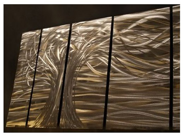
  • High Quality, Durable Metal Wall Art, Made in the USA!
  • Features handsanded finish on the metal that creates a mesmerizing holographic effect!
  • MASSIVE 80 INCHES WIDE 24 INCHES TALL 2 INCHES DEEP!
  • VERY Simple, Easy and Quick to Hang Indoors and Outdoors!
  • Signed and Dated by American Artist - Ash Carl

This 7 panel metal wall sculpture by artist Ash Carl will mesmerizeyou and your guests! The handsanded finish on the metal creates a unique 3 dimensional effect. As you pass by, the artwork seemingly "moves" by reflecting any light in the room. Lighting brings out amazing movement and texture in each panel! The metal and it features an amazing array of detail. These pieces cannot be justified by pictures. The reflections that are hand carved into each piece can only show there best qualities in person. If you are looking for other color combinations, check out the other 80 designs of metal wall art by Ash Carl


Artwork : Megan Duncanson 'Striving to Be the Best' Abstract Metal Wall Art, Modern Home Décor, Contemporary Wall Sculpture


Artwork - Megan Duncanson 'Striving to Be the Best' Abstract Metal Wall Art, Modern Home Décor, Contemporary Wall Sculpture

  • High Quality Welded Construction
  • Hand Sanded Design
  • Painted Steel
  • Corrosion Resistant Finish
  • Size: 23.5" T x 10" W Inches

Bring movement and color to your white walls with this 'Striving to be the Best' metal wall sculpture by Megan Duncanson. These metal wall hangings consist of torch-cut 18-gauge steel layers, stud construction, and one-of-a-kind hand-sanding, which creates a three dimensional visual effect that is comparable to a hologram. With over 500 artworks to choose from, there is something for every taste and every room in your home.

Artwork : Pandemoneum III Wall Sculptures by Ash Carl

Pandemoneum III Wall Sculptures by Ash Carl

Pandemoneum III Wall Sculptures -1 by Ash Carl

Pandemoneum III Wall Sculptures -2 by Ash Carl

  • High Quality Welded Construction
  • Hand Sanded Design
  • Painted Steel
  • Corrosion Resistant Finish
  • Size: 23.5" T x 51 W

This 4 panel metal wall sculpture by artist Ash Carl will mesmerize you and your guests! The hand sanded finish on the metal creates a unique three-dimensional effect. As you pass by, the artwork seemingly "moves" by reflecting any light in the room. Lighting brings out amazing movement and texture in each panel! Paint is applied to protect the metal and it features an amazing array of colors and detail. These pieces cannot be justified by pictures. The reflections that are hand carved into each piece can only show there best qualities in person. If you are looking for other color combinations, check out all designs of painted metal wall art by Ash Carl. Ash's artwork is collected by thousands worldwide and is MADE IN THE USA!


Contemporary Media Centre Oberkirch in Germany by Wurm + Wurm Architects

Wurm + Wurm Architects designed the Media Centre Oberkirch in Germany.

Contemporary Media Centre Oberkirch in Germany by Wurm + Wurm Architects

Contemporary Ladder in Media Centre Oberkirch in Germany by Wurm + Wurm Architects

Look Outside in Contemporary Media Centre Oberkirch in Germany by Wurm + Wurm Architects

Media Centre Oberkirch in Germany by Wurm + Wurm Architects

Suit Table For Children an Contemporary Media Centre Oberkirch in Germany by Wurm + Wurm Architects

The centrally positioned open staircase is not only a movement and communication zone, but is an exposure element for the inside-recumbent zones of utilisation with the generously glazed upper light. The facades, with the large apertures, are understood like shop-windows, which permit varied and exciting views in the surrounding town space. The external, brighter window areas serve the reading zones and stay zones, partially furniture with an up and down movement are integrated which the visitor can use as a table or a bench.

The “Media Centre Oberkirch” was decided in 2007 within the scope of a competition by the architecture office Wurm & Wurm for himself. Start of construction was in November, 2008, completion of the building was in February, 2010.
The following units of utilisation with a total area of 2100 square metres are in the building.
Media Centre (former town library) = 1000 square metres
Event space = 190 square metres
Town archive = 400 square metres

Visit the Wurm + Wurm Architects website

Photography by Guido Gegg

Panorama St. Barths Residence on the Caribbean island by Barnes Coy Architects

Barnes Coy Architects designed this residence on the Caribbean island of St. Barthelemy.

St. Barths Residence on the Caribbean island  by Barnes Coy Architects

Swimming Pool St. Barths Residence on the Caribbean island  by Barnes Coy Architects

Meeting Furniture St. Barths Residence on the Caribbean island  by Barnes Coy Architects

Bedroom Furniture St. Barths Residence on the Caribbean island  by Barnes Coy Architects

Bethroom Set St. Barths Residence on the Caribbean island  by Barnes Coy Architects

Dinning Furniture St. Barths Residence on the Caribbean island  by Barnes Coy Architects

Ladder Design St. Barths Residence on the Caribbean island  by Barnes Coy Architects
The house is sited on a high, thin peninsula, affording 270 degree views from South through West to North. The long axis of the house is perpendicular to the axis of the peninsula, aligning it with sunrise and sunset. The main space is open from North to South, with bedrooms behind a wall that angles away toward the South-East, making the space wider at the West end of the house.

Visit the Barnes Coy Architects website

Photography by Robert Moore Brown

World of Hats Akio Hirata’s Exhibition of Hats by Nendo : Japanese design studio

The graphic and exhibition design for the first major Japanese retrospective of internationally-known milliner Hirata Akio’s seventy years of work. Hirata oversaw the shape of these hats, which float and stream through the exhibition like ghosts or shells of the real hats exhibited.

Akio Hirata’s Exhibition of Hats by Nendo - Japanese design studio

World Hats Akio Hirata’s Exhibition of Hats by Nendo - Japanese design studio

Like UFO World Made Akio Hirata’s Exhibition of Hats by Nendo - Japanese design studio

Beauty Hats Akio Hirata’s Exhibition of Hats by Nendo - Japanese design studio

Amazing Ideas Akio Hirata’s Exhibition of Hats by Nendo - Japanese design studio

Flooded with roughly 4000 of these ‘ghost hats’ as though shrouded in a cloud, the exhibition space softly invites visitors inside. There, they find not clear-cut paths to follow but an environment in which they can wander and discover Hirata’s creations as they like, as a way of physically experiencing the creative freedom that underlies Hirata’s work.

Visit the Nendo website

Related Posts Plugin for WordPress, Blogger...
 
Copyright © Contemporary Design. Original Concept and Design by My Blogger Themes